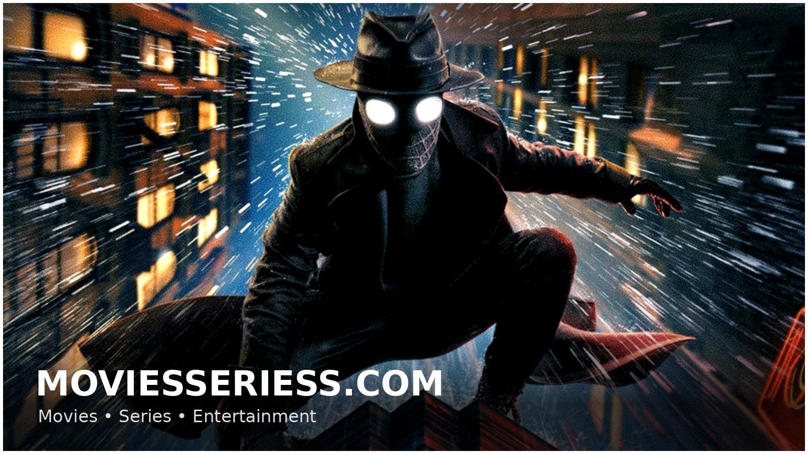
Even before pressing play, Spider-Noir’s introduction gives viewers an odd choice to make. The series is available in two different visual styles, authentic black and white or full color. Both versions tell the same story but the experience of watching it is surprisingly different depending on which one you choose.
So is the classic noir route worth going, or should you stick with the bright modern presentation? Here’s a closer look at what each version has to offer.
A Dark Detective Story in an Alternate Universe of Spider-Man
Spider-Noir is set in a re-imagined New York in the 1930’s and follows Ben Reilly (Nicolas Cage). Ben, formerly the city’s masked hero, has long since given up his crime-fighting persona after a devastating personal loss.
Now a struggling private investigator, he is pulled into a dangerous new mystery. Old wounds reopened, powerful enemies rising, Ben may once again become the Spider…
The eight-episode series premiered on MGM+, then moved to Prime Video, allowing viewers to watch the story in black and white or in color.
Why the Black-and-White Version Feels Like the Definitive Version
The black-and-white edition appears to be the format that the creative team had in mind from the outset. Each frame is steeped in the visual language of classic noir, where shadows often tell as much of the story as dialogue.
There is no color to distract from the series’ dependence on contrast, lighting and composition. Dark alleyways feel more threatening, silhouettes are more striking, and the overall atmosphere carries a sense of mystery that perfectly matches the detective narrative.
The monochrome presentation adds further dramatic weight to many scenes. Reflections, smoke-filled rooms, neon lights and dramatic weather effects are all highlighted in a way that feels deliberately cinematic. Character expressions also become more prominent, drawing viewers more into the emotional side of the story.
Rather than feeling dated, the black-and-white imagery gives the series a distinctive identity that sets it apart from other superhero adaptations.
What the Color Version Adds to the Screen
The full-color version is a whole other beast. It uses a stylized comic-book approach with bold, highly saturated colours that are not realistic but still contain elements of the period setting.
Costumes are more visible. Set designs are more detailed. Locations are more colorful. The characters look good (the colors pop) and the world feels bigger, more lived in.
Fans of production design will probably have fun seeing all the details of the 1930s-inspired setting. The color version allows you to see the fabrics, architecture and decorative details that can get lost in the black and white version.
But the added visual energy sometimes works against the noirish atmosphere. There are some tense moments, but they lose some of their tension because the bright colors lighten the darkness so much a part of classic detective stories.
Which Version Should You Pick?
Both are worth watching, but if you’re only going to get to see Spider-Noir once, then the black and white version is the way to go.
The monochrome look is very much noir, adding to the mood, tension and visual storytelling in ways that feel natural to the series’ premise. It elevates the show from a simple superhero mystery to something that resembles a lost detective classic from the golden age of Hollywood.
That being said, those who like bright colors and want to see all the details of the costumes and set design may find the color version preferable.
Final Say
The best experience of Spider-Noir is in black and white for the most immersive and atmospheric experience. The format really does justice to the essence of noir filmmaking and is a far better fit for the story’s themes than the colorful alternative. The full-color one is still a visual delight, but the black and white one feels more like the one that defines the series.